Big Monograms!

mwp

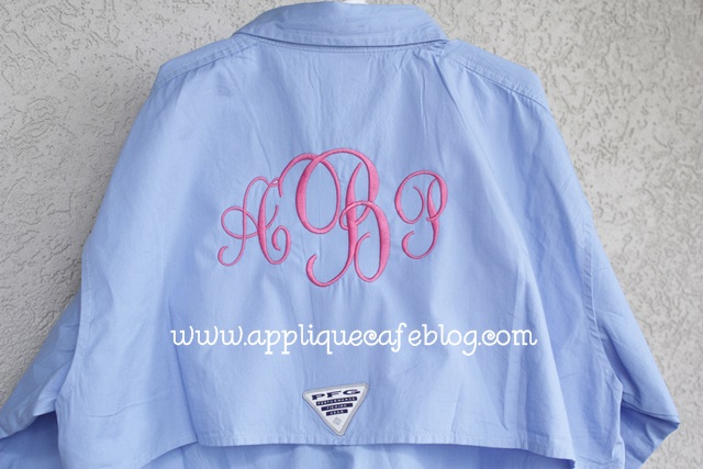
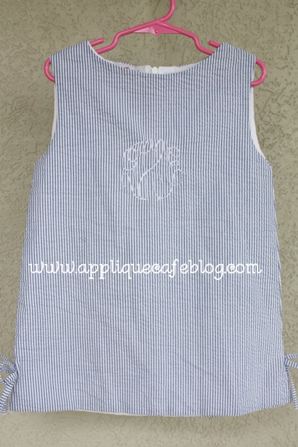
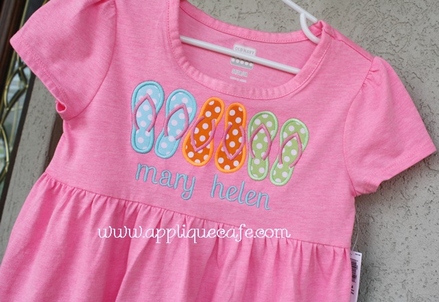
Good afternoon! I’m excited to be “back to work” this week after being lazy at the beach all last week with my family. When I say family, I mean throughout the week we had 17 people under one roof. My entire family goes for a week every summer to the Seagrove/Seacrest Beach area. We are enjoying summer and trying to stay cool! I posted this PFG (Performance Fishing Gear) shirt a few weeks ago. I did this for my 13 year old niece. I’m sure she saw it on Pinterest or something! This shirt led me to this post on adjusting fonts in Monogram Wizard Plus to make your monograms BIG. It’s certainly not rocket science, but perhaps you haven’t thought about it much. You can adjust the width of your fonts so that the end result is a big monogram that fills the hoop as much as possible!

IMG_7924

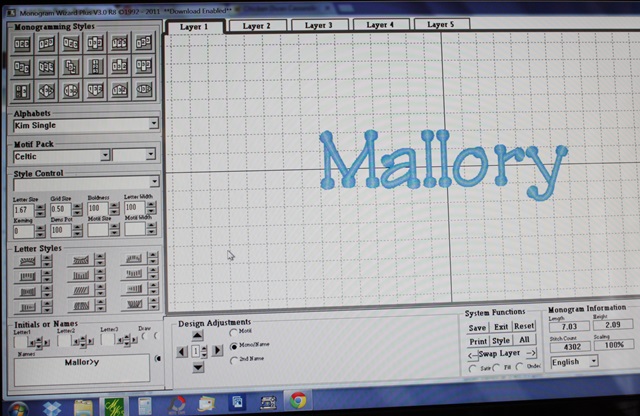
Pardon my photos. I’m sure there is a screen-capture-something that is easier to use than Prt Sc, then opening and pasting in Paint, blah blah blah. I’ll do my research on that. In the meantime, here are MY screen shots via my camera. This is just a regular monogram done in Monogram Wizard Plus using Kim Single font. As you can see (with your magnifying glass perhaps), the Letter Size is 1.67 and everything else (i.e. boldness, letter width, kerning, etc) is default 100. At Letter Size 1.67, the name turns out to be 2.09″ tall and 7.03″ wide, which would probably fit in your 5×7 hoop just fine. Not too bad, but by adjusting the Letter Width, you can make the name taller which appears bigger even though you are still in the 5×7 hoop.

IMG_7950

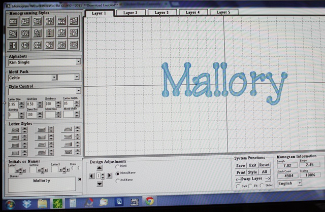
Here I adjusted the Letter Width to 85 and the Letter Size to 1.95. My name is now 2.45″ tall and 7.02″ wide. Basically what I am doing is making the letters “skinnier” and taller. Width of the name stays about the same to fit in the 5×7 hoop.

IMG_7951

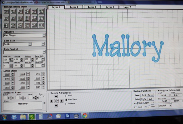
Here I decreased the Letter Width down to 75 and Letter Size to 2.20. Now my name is 2.77″ tall and 6.99″ wide. By decreasing the Letter Width and increasing the Letter Size, Mallory is now almost 3/4″ taller than what I started out with! With some fonts you can also adjust the Kerning, which makes letters closer together or farther apart. With this particular font I can’t really get them any closer together.

IMG_7952

You might notice above, the “>” in Mallory (Mallor>y). See THIS POST for an explanation of that! If your letters are spaced unevenly with certain fonts, check out the post!

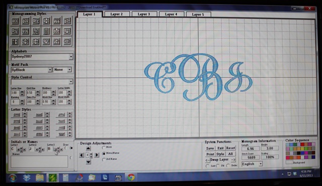
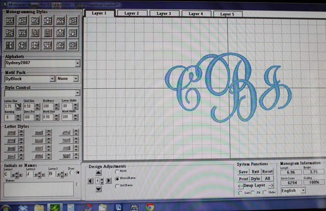
So now on to another PFG shirt I did for my other niece. I want the monogram as big as I can get it and I want to use my 5×7 hoop. As you can see below, Letter Size is 3.00 and everything else is default. The monogram size at these settings is 6.96″ wide to fit the 7″ wide hoop, and 3.00″ tall. Not bad, but I can get it a little bigger. This is Monogram Wizard Plus “Sydney” font.

IMG_7981

Below I adjusted the Letter Width to 85, which “skinnies” up the monogram to 5.85″ wide (still 3″ tall). I can now increase the Letter Size to get the width back up to closer to 7″.

IMG_7982

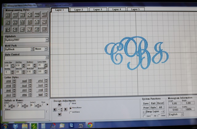
I bumped the Letter Size up to 3.55 (Width is still 85) and now the monogram width is 7.01″ and 3.55″ tall. Bigger!

IMG_7983

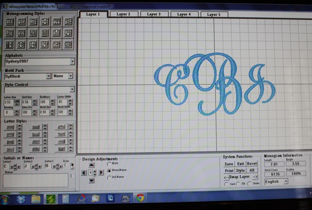
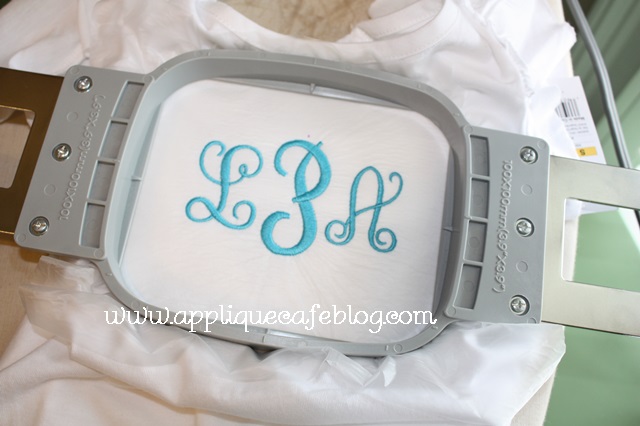
Below I adjusted my Letter Width a little more, down to 80, and Letter Size up to 3.75. NOW my monogram is 6.96″ wide and 3.75″ tall. By making these adjustments, my monogram went from just 3″ tall to 3.75″ tall. It fills the hoop much better and the monogram will be much bigger on the shirt.

IMG_7984

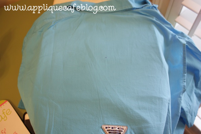
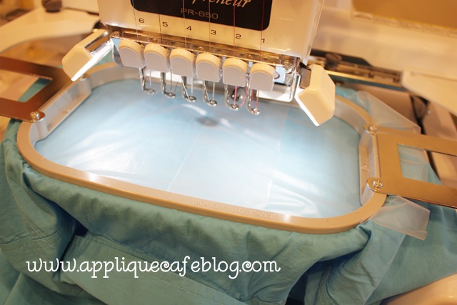
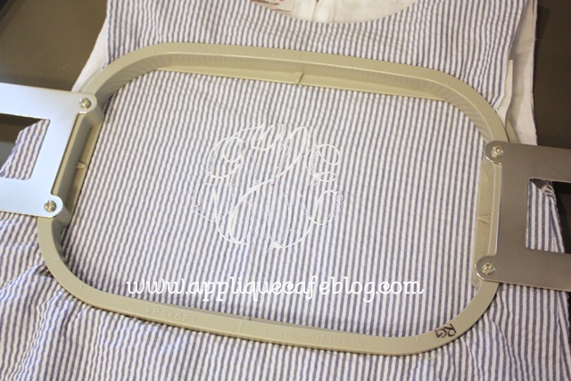
I took a few shots of the shirt as I got it ready to monogram. I marked my center on the back of the shirt (top panel).

IMG_7985

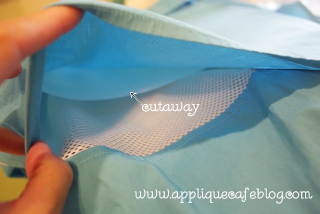
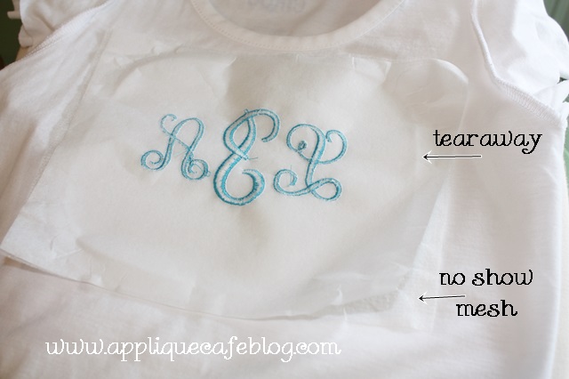
These shirts are “vented” so I inserted a piece of cutaway between the top layer I’m monogramming and the “net vent stuff”.

IMG_7986

On my 6 needle machine, I hoop with the frame inside the shirt. Again, I’m using cutaway on the inside and I am using water soluble on top (just for extra stabilization). I only had precut squares of the solvy so that’s why you see 2 pieces.

IMG_7987

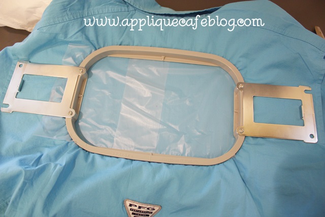
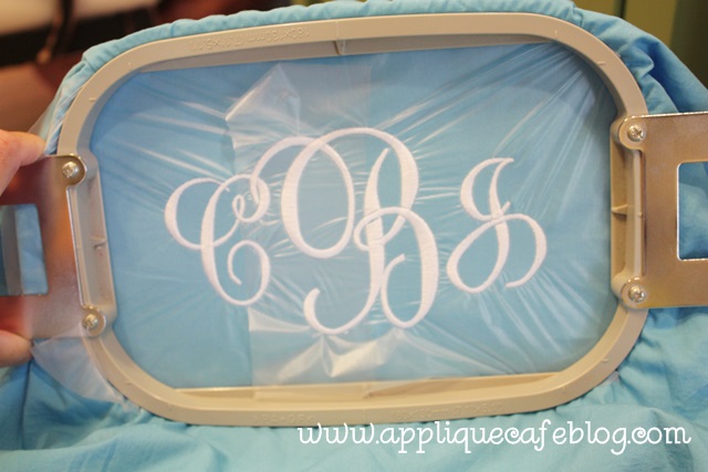
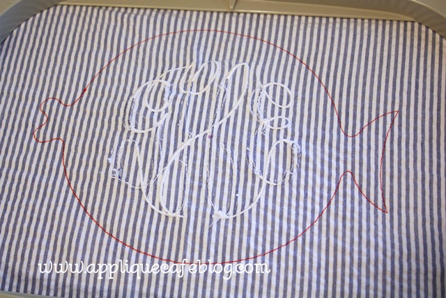
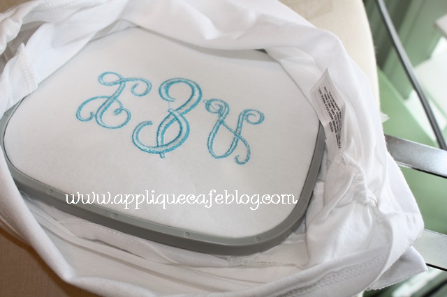
I put the hoop on my machine upside down, so the monogram is rotated upside down and I had to make sure the arm of my machine was inside the 2 layers of shirt! Sorry this part is a little confusing! If you ever try to monogram one of these shirts, this will make sense.

IMG_7988

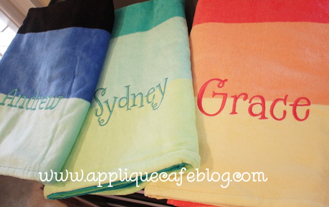
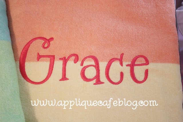
Here is the finished shirt. When finished I unhoop, trim the excess cutaway stabilizer from the inside and then just pull away all the water soluble from the top.

IMG_7989

I hope that helps! Again, NOT rocket science with the width/letter size adjustments, but if you are a newbie you may not have realized you could make your monograms a smidge bigger!

Towels and Fish

It’s June already (and this is my 2nd blog post in the past week)!! It’s going to be a great summer! Yesterday I FINISHED every single piece of “customer work” I had to do, so now it’s time to dig in to some other things. I got some great sample blanks at the Everything Applique Conference, so I want to *do* something with them and post about them (coming soon). I also have a pile of samples from EAC I need to sell and a few things to do for Mallory too.

You know how I always say I like to use FILL STITCH when I do towels? Well, I have an exception to the rule. I had a customer bring me these beach towels to monogram, and she specifically said “nothing too thick”. These are from Tarjet I think, and they are cute little towels and also relatively thin. In this case, I DID NOT use fill stitch. I made sure my font was thin enough to do satin stitch. These names pretty much filled the 5×7 hoop, so close to 6.5-7″ wide. In Monogram Wizard Plus you can adjust the boldness (thickness or fatness of the satin stitch) of a font so I did decrease the boldness on the right 2 girl towels. The font is MWP Specs. On the left boy towel, I used MWP Kazoo font and the name wasn’t too thick at this size, so I don’t think I had to adjust the boldness on it. If this is all confusing to you, stay tuned for my next post on Monogram Wizard Plus and adjusting a font’s width and boldness and all that good stuff.

IMG_7934

Specs is a wonky font, so I did the letters in layers and then arranged them all in Sew What Pro. See this post for more info b/c I didn’t take pictures of how to do it.

IMG_7935

Now on to a project I did today for Mallory. I bought this a-line dress/top at an overstock sale several months ago. It was all of like $8 or $10 and was a sample from Red Beans clothing line. It had a monogram on it, but I got it anyway. When I see something monogrammed, I usually see A) if it will come out easily and B) if I can cover it. I did a little bit of both on this one.

IMG_7938

As you can see below, I took out what I could of the monogram ~ mainly the fat parts that I could easily cut (with a seam ripper or small scissors) and pull out. The dress/shirt was fully lined, so I didn’t have access to the back side and bobbin thread and could only take out the monogram from the front which was a little tricky. Anyway, I took out what I could and decided to move on. You can also see where I marked the approximate center of the monogram. My plan was to cover it with an applique!

IMG_7939

As I said, it was fully lined (covering the back of the monogram) and I didn’t want to mess with the lining.

IMG_7941

I used medium cutaway stabilizer on the back side of the dress and hooped it so that the monogram was pretty centered in the hoop. You want to make sure the applique will cover the entire monogram.

IMG_7942

I chose our Fat Fish Design to cover the monogram. As you can see below, I sewed the marking stitch first. I then had an idea… what if I cut out the seersucker fabric and monogram INSIDE the marking stitch LEAVING the lining in tact. Had I thought of this before, I would not have wasted 20 minutes trying to take out part of the monogram. See my post on Layering Fabrics in an Applique for more info on this.

IMG_7943

As you can see, I trimmed closely inside the fish. The white you see is the lining of the dress/shirt (I’m honestly not sure which it is, dress or top, but we plan to wear this w/ shorts).

IMG_7944

I am using red Ta Dot fabric because I have a pair of little ruffle shorts she is going to wear this with. I use Heat N Bond Lite on the fabric (of course).

IMG_7945

Ready for the tackdown stitch!

IMG_7946

Here I have trimmed the fabric closely. I love my Gingher 4″ curved scissors! It will then stitch the eye and around the fish and I stopped the machine and left off the fin that is shown on this design.

IMG_7947

Here is the finished outfit! I got the shorts from Doodles Boutique. This will be great for the summer AND it’s a little patriotic for the 4th of July!

IMG_7948

I love this fish!

IMG_7949


I also did this Fat Fish last year to match a pair of shorts I got at the same overstock sale! I believe the shorts are from Red Beans too!

IMG_6022

Lastly, I posted on Facebook yesterday that you can make pretty much any design patriotic by using red, white & blue fabric, like in the outfit above. Here is also a pic of our Popsicle Trio design done in RW&B fabrics! Have a great week!

popsicle trio rwb 500

Happy May!

Happy Tuesday, April 30th! I’m not going to start out this post by apologizing for not posting lately. That’s getting old. I’m busy and you’re busy blah blah blah. For some reason I loaded my pictures for this post, and they are all backwards, so bare with me. Yesterday I had a small panic attack when I filled in our calendar in our office for May. The picture you see here is not even accurate, as I added several things after I took the picture. School is ending (eeek!!!), boys are both playing soccer (rec league and travel for 1 of them), the Everything Applique Conference is coming in in like 2 weeks (and today is the last day to register), etc. Anxiety is setting in and I’m not sure how I’m going to survive the month. Did I mention that it’s also my husband’s birthday + Garrison’s birthday + Browder’s birthday + our triplet nieces and nephew’s birthday + our 12 year anniversary, all in May? AAAccckkkkkkk!!!

IMG_7760

Here are a few things I’ve been up to lately when I haven’t been stressing over the calendar. Sissy had a birthday party to go to this past weekend and they have a pool, so I had in mind to find a cute towel to monogram. I have to say, I was disappointed in the beach towel selections at Target and Walmart. I found this cutie at Kohls! I was also at TJMaxx yesterday and they had some cute ones too. Hopefully Target and Wally World will do better next year. I used Monogram Wizard Plus “Specs” font for her name. What a bright and cheerful towel!

IMG_7759

Here’s an Old Navy dress I did recently, and I think you can get these for dirt cheap. They are perfectly BLANK, so you can easily jazz it up with a monogram or applique design. I used our Flip Flop Trio design and some bright fabrics and it turned out cute! I love the blue on the pink, and this pink is brighter and more “highlighted” than it looks. My kids call fluorescent “highlighted”. I think I used MWP “Penpal” for this font.

IMG_7482

In my last post, I discussed No Show Mesh cutaway stabilizer. I STILL love my medium cutaway, but I did some tees recently and used the no show mesh b/c this particular tee was thin. Some tees are thicker than others so this is a great option for those that are not as thick (where medium cutaway might really show through). Again, my pictures are backwards so this is a shot of the t-shirt after I un-hooped. I used a little spray adhesive to “stick” the no show cutaway to the back of my shirt. This time I ironed some iron on tearaway on the back of that (rather than “floating” it underneath the hoop), so I had 2 layers of stabilizer hooped with the shirt.

IMG_7480

As you can see here, I hooped all 3 layers (tshirt, no show mesh and tearaway) together.

IMG_7479

Actually 4 layers b/c I used a layer of solvy on top. So on the back of the t-shirt – 1 layer no show mesh, 1 layer of iron on tearaway and on the top, solvy. I’ve gotten to where I am using solvy more and more on top of t-shirts, mostly when I am doing monogramming. If the shirt is a little thin, then it helps the shirt not to gather in the monogram (like on the ends of the letters). When I’m done, I remove the solvy and tearaway and then trim the no show mesh around the monogram. This is MWP “Pendant” font.

IMG_7478

We listed this Bug Jar Applique Design on Monday, which was featured on a t-shirt in Sew Beautiful magazine in their May/June 2013 issue. There is a fabulous article on TJ’s Fabrics in the issue, and I was lucky enough to sew a t-shirt with this design on it for one of the cute little models to wear!

Bug Jar 500

It’s always fun to see your name in print!

IMG_7475

Here is the cute shirt which was made to match the cargo shorts made by TJ’s using their Michael Miller  Baby Bug Jar fabrics.

IMG_7472

If you subscribe to Sew Beautiful or see it in your local fabric store, pick up a copy! It’s a great article! The outfits they featured are gorgeous!! TJ’s is located in Opp, AL, so don’t forget to plan accordingly if you are traveling to the beach this summer!!

IMG_7471

We just got back from a Dream Disney little vacation. The boys have been to Disney once, but Mallory had never been. We decided to try a Disney Cruise this year, but hit Magic Kingdom for the day on our way down. If you are going on a Disney Cruise, let me know. I wrote a book on it (not really) when we got back for some friends who are heading that way in a couple of weeks. It really was MAGICAL!! The cruise was massive and amazing and we will definitely go again! Here are just a few pics ~ I will spare you of the 253 I uploaded from my camera.

This was right before we left the park. War Eagle! I hope the people on the left figured out their phone settings…

1IMG_7536

Here is the “Sail Away” party on the ship the evening we left the Port. Yes, there were like 4,000 people there. I think the recommended pool capacity was exceeded. This is the Disney Dream ship which comes and goes from Port Canaveral in Florida. It has an awesome tube slide called the “Aquaduck” that goes literally off the side of the ship, and then around it.

1IMG_7543

Here we are riding the Aquaduck. We rode it many many times (as many as the kids could talk us in to).

1IMG_7581

We met Mickey, Minnie, Goofy and all of the other Disney characters and Princesses (several times). I was fascinated by the characters as much as the kids were!

1IMG_7748

Chip & Dale got on the elevator with us one day.

1IMG_7633

The kids got to play basketball with Goofy!

1IMG_7720

It was so much fun! We HIGHLY recommend it! Again, if you are planning a Disney cruise and want to read my tips and suggestions, let me know!

1IMG_7724

All designs at Applique Cafe are on sale through May 7th, and we are listing 3 more new designs today or tomorrow! Have a great week!